Best Fonts for Film Credits
Typography is the first thing an audience reads and the last thing most filmmakers think about. The wrong font turns a $50 million production into a student film in the final thirty seconds.
Choosing a film credits font is not a cosmetic decision. It is a readability problem, a legal requirement, and a branding opportunity rolled into one. The font you select for your end credits must survive motion, compression, projection at scale, and the scrutiny of guild compliance officers who will measure it with a ruler.
This guide covers what the industry actually uses, why it works, and how to make the right call for your production — whether you are finishing a studio feature or a no-budget short.
Film Credits Font
The Typefaces That Define Professional Credits
The film industry has settled on a surprisingly narrow range of typefaces for end credits. The reason is practical: credits scroll, names are small, and readability at speed matters more than aesthetics.
The workhorses:
| Font | Type | Used By | Why It Works |
|---|---|---|---|
| Helvetica Neue | Neo-grotesque sans-serif | Studio tentpoles, network TV | Neutral, readable at any size, massive weight library |
| Futura | Geometric sans-serif | Wes Anderson (all films), Gravity, Interstellar | Clean geometry, strong at small sizes |
| Frutiger | Humanist sans-serif | European co-productions, Criterion releases | Designed for signage readability — performs well in motion |
| DIN | Industrial sans-serif | German/Nordic productions, documentaries | Mechanical clarity, excellent condensed weights |
| Avenir | Geometric sans-serif | Apple-era productions, streaming originals | Modern Futura alternative with better legibility |
| Gotham | Geometric sans-serif | The Social Network, prestige drama | Contemporary, confident, pairs well with display faces |
These are not creative choices. They are engineering choices. A font that works for end credits must have:
- High x-height for legibility at small sizes
- Open counters so letters do not close up during compression
- Multiple weights (light through bold) to build hierarchy between roles and names
- True condensed cuts for fitting long department headings
- Full Unicode support for international names with diacritics
As one filmmaker on r/Filmmakers put it about credits formatting: “Make the shortest version of the credits possible.” The font you pick either helps or hinders that goal.
Rolling Credits Font
Choosing Fonts That Survive Motion
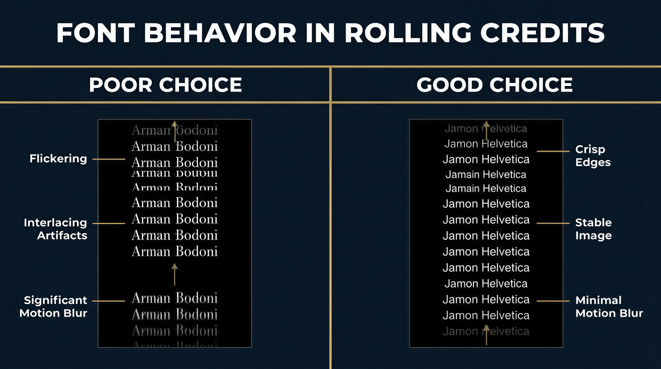
A rolling credits font faces a challenge static text never encounters: it must remain legible while moving vertically at a steady rate. Thin strokes shimmer. Tight spacing blurs. Fine serifs disintegrate.
What happens to type in motion:
- Horizontal strokes thinner than 1 pixel at render resolution will flicker
- Tight letterspacing causes adjacent characters to merge
- Decorative serifs create visual noise at scroll speed
- Low-contrast faces (uniform stroke width) outperform high-contrast ones
This is why the overwhelming majority of rolling credits use sans-serif typefaces. The few productions that use serifs — typically period dramas or prestige literary adaptations — choose robust faces like Georgia, Plantin, or Mercury with thick enough strokes to survive motion.
Recommended fonts for rolling credits:
- Helvetica Neue Light/Regular — The default. Clean, unambiguous, disappears into the background.
- Univers — Adrian Frutiger’s systematic family. Excellent condensed weights for department headings. The 55 Roman weight is a credits workhorse.
- Proxima Nova — A modern web-friendly alternative with strong screen rendering.
- Inter — Free, open-source, designed for screens. Excellent for lower-budget productions that need professional results without licensing costs.
- Aktiv Grotesk — Dalton Maag’s Helvetica competitor with better screen performance.
Font size guidelines for rolling credits:
| Delivery Format | Minimum Name Size | Department Heading Size | Role/Title Size |
|---|---|---|---|
| Theatrical (DCI 4K) | 24pt equivalent | 28-32pt | 20-22pt |
| HD Broadcast (1920x1080) | 18pt equivalent | 22-26pt | 16-18pt |
| Streaming (variable) | 20pt equivalent | 24-28pt | 18-20pt |
These are starting points. Always test your credits on the target display. Guild agreements — particularly DGA and SAG-AFTRA requirements — specify minimum credit sizes relative to the largest individual credit, so your font choice directly impacts compliance.
Movie Credits Font
What Separates Credits Typography from Everything Else
A movie credits font is not a poster font, a title font, or a subtitle font. It serves a specific function: delivering hundreds of names in a structured hierarchy while remaining readable and unobtrusive.
The hierarchy typically runs:
DEPARTMENT HEADING          ← Bold or caps, larger size
Role Title                  ← Medium weight, slightly smaller
    Person Name             ← Regular weight, standard size
    Person Name
    Person Name
Wes Anderson uses Futura across all his films — titles, credits, on-screen text. John Carpenter set his credits in Albertus, a formal serif that became synonymous with 1980s horror. Woody Allen has used Windsor for more than 40 films. Sean Baker shoots his credits in Aguafina Script. As Fast Company noted, “For filmmakers with a fondness for certain fonts, using them frequently enough in their work can turn typography into a sort of signature.”
These are auteur choices. For most productions, the font should serve the content, not announce itself. That means selecting a face from the neutral sans-serif families listed above and letting hierarchy, spacing, and timing do the expressive work.
Movie Poster Credits Font
The Billing Block: A Different Typographic Challenge
The billing block at the bottom of a movie poster operates under entirely different rules than rolling credits. It must be condensed enough to fit legal copy into roughly 15% of the poster area — an industry-mandated minimum — while remaining technically readable.
The billing block uses ultra-condensed typefaces where character height is four to six times the width. This is a distinct typographic discipline.
Industry-standard billing block fonts:
| Font | Notes |
|---|---|
| Univers 39 Thin Ultra Condensed | The classic. Used on thousands of posters since the 1970s. |
| Trade Gothic Condensed | Film/advertising staple. Clean, functional. |
| Bee Two | Specialty font designed specifically for billing blocks. |
| Steel Tongs | Includes glyphs and symbols common in poster credits. |
| Helvetica Condensed | Safe choice with universal availability. |
| Franklin Gothic Condensed | Historical poster face. Still appears on indie releases. |
The billing block also requires specialty glyphs: the interpunct (centered dot) separating names, specific copyright symbols, and guild logos. Fonts like Steel Tongs and Bee Two include these out of the box. With general-purpose condensed faces, you will need to source these separately.
Note: billing block typography is a poster discipline, separate from the end credits that appear on screen. A production typically uses different fonts for each — condensed ultra-narrow for the poster, readable sans-serif for the rolling crawl.
Old Movie Credits Font
Classic Film Typography Through the Decades

The history of movie credits fonts mirrors the history of type technology itself.
1930s-1950s: Hand-lettered era. Credits were photographed from hand-painted cards. Every title sequence was bespoke. Saul Bass revolutionized this craft — as he told The Academy, he “fell in love with letters” as a sign painter and evolved into the defining title designer of his generation.
1960s-1970s: Phototypesetting. Faces like Optima, Palatino, and Souvenir dominated. Credits gained consistency but lost the hand-crafted quality.
1980s-1990s: Digital typesetting. Adobe’s PostScript fonts became the standard. Trajan — designed by Carol Twombly in 1989 from Roman square capitals on Trajan’s Column — became the defining movie poster font of the era. It appeared on everything from Titanic to The Bodyguard to A Beautiful Mind. The Vox documentary “How One Typeface Took Over Movie Posters” traces how Trajan went from prestige films to B-movies as it became overexposed.
2000s-present: Variable fonts and custom type. Major studios increasingly commission custom typefaces. The Marvel Cinematic Universe uses proprietary display faces. Streaming platforms have house styles. But the credits crawl itself still relies on the same proven sans-serif families — because motion readability has not changed.
Fonts that evoke specific eras:
| Era | Characteristic Fonts | Used For |
|---|---|---|
| Golden Age | Copperplate Gothic, Engravers | Period dramas, noir homages |
| New Hollywood | Optima, Avant Garde | 1970s-set films |
| 1980s action | Trajan, Palatino | Epic/prestige tone |
| 1990s indie | Helvetica, Trade Gothic | Minimalist credits |
| Modern | Gotham, Circular, custom | Contemporary productions |
In American Psycho, the production used Copperplate Gothic for both Paul Allen’s business card and the end credits — a deliberate design decision that unified the film’s visual language. That level of typographic intention separates professional productions from amateur ones.
Film Credits Font Download
Free and Licensable Options for Every Budget
Not every production can license Helvetica Neue or Gotham. Here are professional-quality alternatives:
Free fonts suitable for film credits:
- Inter (Google Fonts) — Designed by Rasmus Andersson for screen readability. Multiple weights, excellent spacing. The best free option for rolling credits.
- Work Sans (Google Fonts) — Clean geometric sans-serif with good condensed weights.
- Source Sans Pro (Adobe, open-source) — Paul Hunt’s versatile family with true italics and multiple weights.
- Barlow Condensed (Google Fonts) — Designed for signage. Strong condensed cuts for department headings.
- Open Sans (Google Fonts) — Commissioned by Google. Neutral, legible, widely available.
For billing blocks specifically:
- Bebas Neue (free) — Popular condensed display face. Works for billing blocks but lacks specialty glyphs.
- Legal Obligation Sans Serif (Wingsart Studio) — Purpose-built billing block font with all required glyphs and symbols.
Premium fonts worth the license fee:
- Helvetica Neue (Monotype, ~$35/weight) — Industry standard.
- Gotham (Hoefler & Co., ~$199/package) — Modern prestige.
- Univers (Linotype, ~$35/weight) — Adrian Frutiger’s masterwork.
When selecting a movie credits font, check the license terms carefully. Many free fonts permit commercial use but require attribution — which is fine for a website but impractical in a credits crawl. Google Fonts and Adobe Fonts (included with Creative Cloud) are the safest bets for production use.
FAQ
What font do most movie credits use?
Most professional productions use Helvetica Neue, Futura, or Univers for rolling end credits. These sans-serif families offer the readability, weight variety, and motion stability that credits require. The specific weight and size vary by delivery format and guild requirements.
What is the standard billing block font on movie posters?
The most common billing block font is Univers 39 Thin Ultra Condensed, though Trade Gothic Condensed and specialty faces like Steel Tongs and Bee Two are also widely used. Billing block fonts are ultra-condensed to fit legally required credit text into roughly 15% of the poster area.
Can I use free fonts for film credits?
Yes. Inter, Source Sans Pro, and Open Sans are all free, open-source fonts with licenses that permit commercial use in film production. They perform well in rolling credits and are available through Google Fonts. For billing blocks, Bebas Neue is a popular free condensed option.
Does font choice affect guild compliance?
Indirectly, yes. Guild agreements specify minimum credit sizes relative to other credits on screen. A font with poor readability at small sizes may force you to increase the overall size, affecting scroll timing and credits duration. Choosing a font with a high x-height and open counters gives you more flexibility. See our complete guide to film credits for detailed formatting requirements.
Sources and Further Reading
- Fonts In Use: End Credits — Archive of real credit sequences with font identifications
- Hoefler & Co.: Titles & End Credits — Foundry perspective on credits typography
- Posterwire: Credit Where Credit Is Due — Deep dive into billing block conventions
Building credits should be as considered as choosing the font that carries them. EndCreditsPro lets you set your typeface, define your hierarchy, and generate broadcast-ready credits without wrestling with timeline-based editors. Start with our credits templates and have professional end credits locked in minutes, not days.