Woody Allen Titles Font: The Story Behind Cinema’s Most Iconic Typeface
White Windsor on a black screen, jazz on the soundtrack. No other director has turned a single font into a fifty-year brand identity.
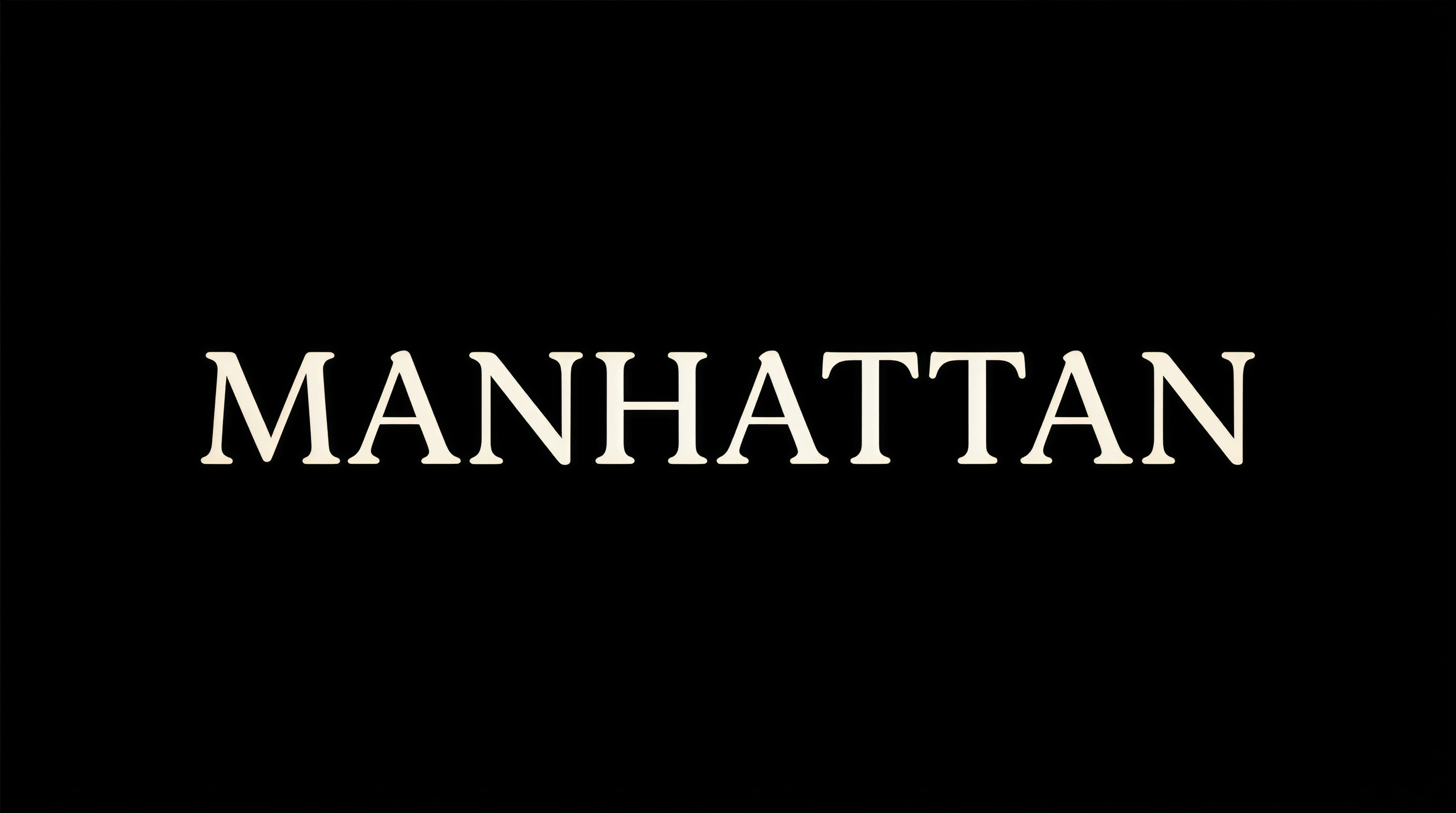
Every film Woody Allen has directed since 1977’s Annie Hall opens the same way: sparse white lettering on a plain black background, set in Windsor Light Condensed, while a jazz standard plays underneath. Across more than fifty films and nearly five decades, the formula has never changed. No animated logos. No visual effects. No variation.
The result is the most recognizable typographic identity in the history of cinema. The Woody Allen typeface — properly called Windsor — has become so synonymous with its director that the font itself carries narrative meaning before a single frame of footage appears.
Woody Allen Typeface
How a Diner Conversation Created a Film Legacy
The origin story reads like a scene from an Allen film. According to the widely cited account, Allen regularly ate breakfast at the same New Jersey diner as Ed Benguiat, one of the most prolific type designers of the twentieth century. Benguiat created or redesigned logotypes for The New York Times, Coca-Cola, and Ford, among hundreds of others.
Sometime between 1975 and 1977, Allen — knowing Benguiat as “a printer” — asked him over breakfast what a good typeface would be for the credits of an upcoming film. Benguiat had a personal affinity for Windsor and recommended it on the spot.
Allen took the suggestion and never looked back.
The specific variant he adopted was Windsor Light, rendered in white against a solid black background. That single recommendation from a chance breakfast encounter became the visual signature of one of the most prolific careers in American cinema.
A competing theory — that the font choice was a tribute to Allen’s filmmaking hero Ingmar Bergman — has been debunked. The Benguiat diner story is the accepted account among typographers and film historians.
Windsor Font
A Typeface Older Than Hollywood Itself
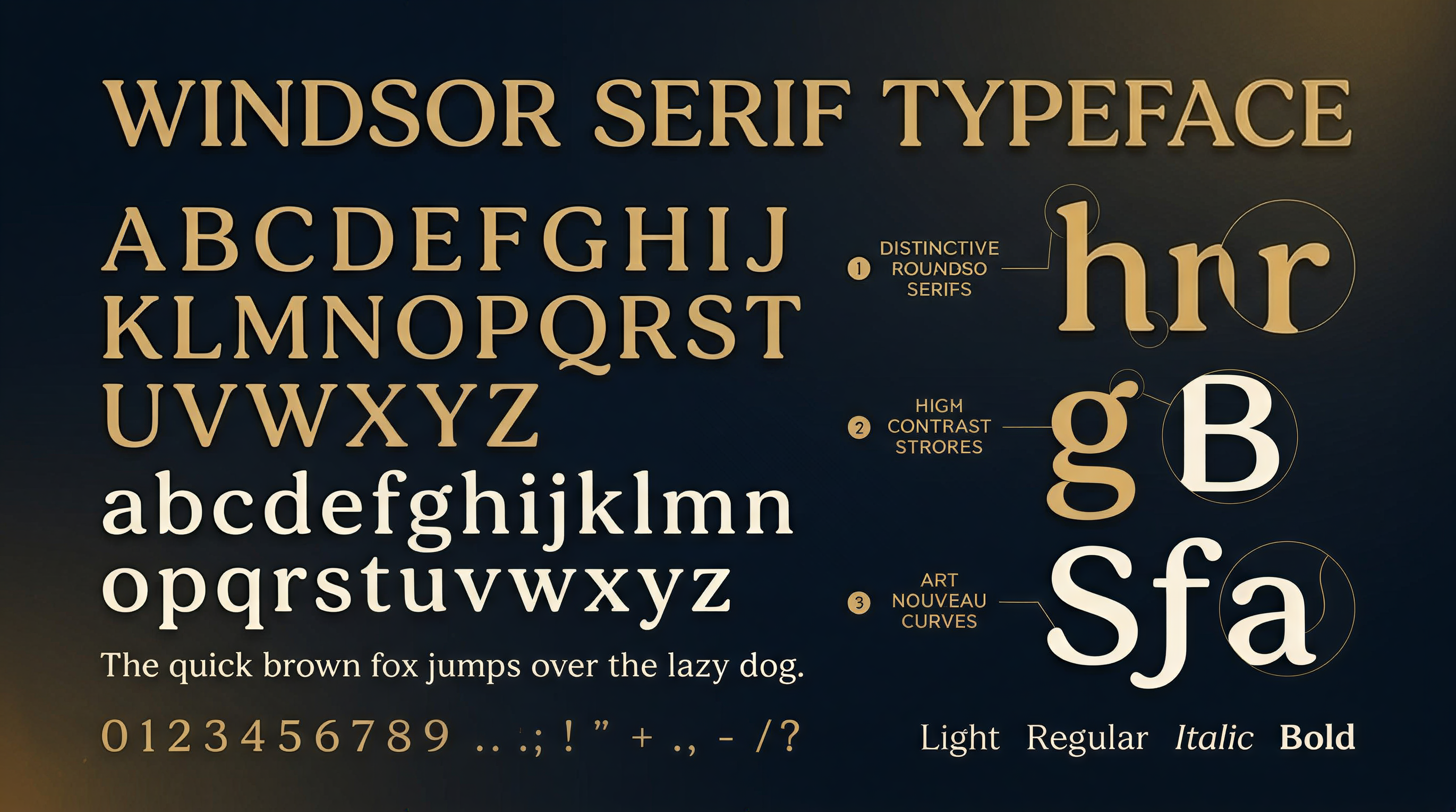
Windsor was designed by Elisha Pechey (1831-1902) and released in 1905 by the Sheffield-based type foundry Stephenson Blake. It predates the American studio system, the Academy Awards, and sound cinema.
The typeface is a display serif with distinctive characteristics:
- Heavy, rounded serifs that give it a warm, approachable personality
- Art Nouveau influence visible in the organic curves of letterforms like g, e, and a
- High contrast between thick and thin strokes
- Playful proportions that distinguish it from more formal Victorian serifs
Windsor was never intended for body text. It was designed for headlines, advertisements, and display — the kind of typeface you might have seen pasted on building facades in London or New York at the turn of the last century.
Windsor variants:
| Variant | Weight | Notable Usage |
|---|---|---|
| Windsor Light | Thin strokes, elegant | Woody Allen title cards (primary) |
| Windsor Light Condensed | Narrow, space-efficient | Allen’s credits sequences |
| Windsor Bold | Heavy, impactful | All in the Family, The Goldbergs |
| Windsor Elongated | Extended width | The Critic credits |
| Windsor Old Style | Original 1905 cut | Historical references |
The font experienced a resurgence in the 1960s and 1970s when photo-typesetting houses like ITC began licensing revivals of Victorian-era faces. This is the version Benguiat would have been familiar with when he recommended it to Allen.
Woody Allen Title Font
Anatomy of the Most Minimalist Title Sequence in Film
Allen’s title design is radical in its restraint. While most directors invest significant budgets in animated titles, motion graphics, and visual storytelling during their opening sequences, Allen strips everything away.
The Allen title formula:
- Background: Solid black. No texture, no gradient, no imagery.
- Typography: Windsor Light Condensed, white, centered.
- Layout: One to three credits per card, displayed sequentially.
- Duration: Each card holds for approximately three to five seconds.
- Audio: A jazz standard — usually New Orleans jazz, swing, or American Songbook — plays throughout.
- Transition: Simple cut between cards. No dissolves, no fades.
This system covers both opening and closing credits. The opening sequence typically lists principal cast alphabetically, followed by key crew, and closes with “Written and Directed by Woody Allen.” The closing credits follow the same typographic system.
The one exception: Interiors (1978) is the only post-1975 Allen film to break the pattern. His most serious, Bergman-influenced drama uses a sans-serif typeface — fitting for a film that is itself an exception to every other Allen convention.
The simplicity is the point. As one typography commentator noted, “Windsor announces Woody Allen as surely as Johnston type announces the London Underground.” The font has become a semiotic shorthand: white Windsor on black means a specific kind of urbane, literate, neurotic New York filmmaking.
Directors and Their Signature Fonts
When Typography Becomes Auteur Theory
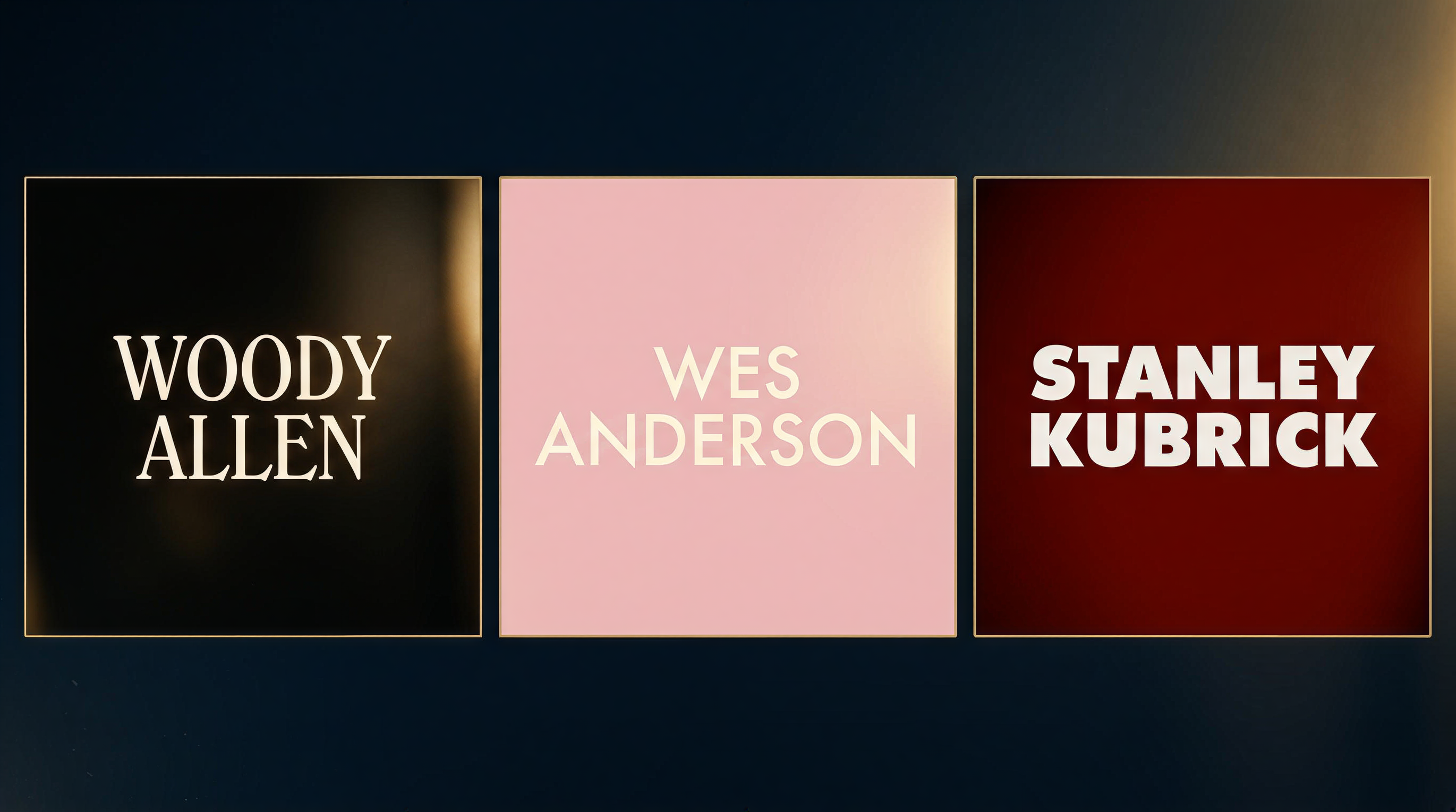
Allen is not the only director whose typographic choices became part of their artistic identity. But he is the most consistent.
| Director | Signature Font | First Used | Films Using It | Style |
|---|---|---|---|---|
| Woody Allen | Windsor Light | 1977 (Annie Hall) | 50+ films | White on black, static cards |
| Wes Anderson | Futura | 1996 (Bottle Rocket) | ~10 films | Centered, pastel backgrounds |
| Stanley Kubrick | Futura Extra Bold | 1999 (Eyes Wide Shut) | 1 film (credits) | Bold, geometric |
| Jean-Luc Godard | Hand-drawn lettering | 1960s onward | Dozens of films | Irregular, political |
Anderson’s use of Futura is the closest parallel to Allen’s Windsor commitment. Futura appears in nearly all of Anderson’s features through The Grand Budapest Hotel (2014), showing up in title cards, chapter headings, on-screen text, and even prop design. But Anderson eventually departed from Futura with Moonrise Kingdom (2012), while Allen has never wavered.
The difference matters. Anderson uses typography as set dressing — one element in an obsessively controlled visual palette. Allen uses typography as a brand mark — a fixed constant that frames everything else as variable.
For title designers working in the industry, these director-font pairings demonstrate how a typographic choice can accumulate meaning over decades. A font is never just a font once it has appeared in fifty films.
Windsor Font in Pop Culture
Beyond Woody Allen
Windsor’s cultural footprint extends well beyond Allen’s filmography, though his usage dominates the conversation.
Television:
- All in the Family (1971-1979) — Windsor Bold for the title card and credits, predating Allen’s adoption
- 227 (1985-1990) — Windsor Bold
- The Goldbergs (2013-2023) — Windsor Bold, a deliberate retro choice for a 1980s-set comedy
Print and publishing:
- The Whole Earth Catalog (1968-1972) — Windsor on the cover of the counterculture’s defining publication
- Various 1970s advertising and editorial design — Windsor was a staple of the photo-typesetting era
Film (beyond Allen):
- Monty Python and the Holy Grail (1975) — Windsor Bold for the “Intermission” card
- After the Hunt (2025) — Director Luca Guadagnino deliberately used Windsor Light for the opening credits as a direct reference to Allen’s visual language
The Guadagnino case is particularly significant. When After the Hunt premiered at Venice in 2025, the Windsor title cards immediately signaled the film’s thematic relationship to Allen’s work. Guadagnino explained that while developing the film, his team “couldn’t stop thinking of Allen’s films such as Crimes and Misdemeanors or Another Woman or Hannah and Her Sisters.” The font choice was an intentional nod — and an acknowledgment that Windsor now carries intertextual meaning independent of any individual film.
How to Recreate the Woody Allen Title Look
A Practical Guide for Filmmakers
Whether you are referencing Allen’s style deliberately or simply want clean, classic title cards, here is how to reproduce the look.
Font sourcing:
- Windsor (licensed): Available from commercial type distributors. The full family includes Light, Regular, Bold, and Condensed weights. Licensing typically costs $30-$80 per weight.
- ITC Windsor: The most common digital version, available through Monotype and other distributors.
- Free alternatives: No exact free match exists, but EB Garamond and Libre Baskerville offer similar warm serif characteristics for productions on tight budgets. For a closer match, Sorts Mill Goudy captures some of Windsor’s Art Nouveau warmth.
Technical specifications for the Allen look:
| Parameter | Setting |
|---|---|
| Font | Windsor Light or Windsor Light Condensed |
| Color | Pure white (#FFFFFF) |
| Background | Pure black (#000000) |
| Alignment | Centered horizontally and vertically |
| Size | Large enough to command the frame; typically 60-80pt equivalent at 1080p |
| Tracking | Slightly loose (+20 to +50) for elegance |
| Card duration | 3-5 seconds per card |
| Transition | Hard cut (no dissolves) |
Common mistakes to avoid:
- Adding a drop shadow or glow — Allen’s titles are completely flat
- Using Windsor Bold instead of Light — the bold weight has a completely different character
- Centering vertically but not optically — mathematical center often looks too low; nudge text slightly above center
- Rushing the cards — Allen’s pacing is deliberately unhurried
For a deeper look at how font choices impact every phase of the credits process, see our complete guide to film credits format and order.
Why Windsor Works
The Typography Behind the Brand
Windsor’s effectiveness as Allen’s signature is not accidental. The font’s personality aligns precisely with the tone of his films.
Warmth without sentimentality. Windsor’s rounded serifs and organic curves feel approachable and human, but the overall letterforms maintain enough structure to avoid feeling soft. This mirrors Allen’s narrative voice: personal and intimate, but intellectually rigorous.
Sophistication without pretension. Windsor is a display face, not a text face. It was designed to attract attention, but its proportions are modest compared to the aggressive geometries of Art Deco or Modernist display types. It suggests culture without demanding reverence.
Timelessness through anachronism. A font designed in 1905, popularized in the 1970s, and still in use in the 2020s exists outside any single design era. It cannot be dated because it was already old when Allen adopted it.
Readability in motion. Windsor Light’s open counters, generous x-height, and high stroke contrast make it legible even at moderate sizes on screen — a practical advantage for title cards that must be read in three to five seconds.
The lesson for any production choosing a credits font is that the best typographic choices are not trendy. They are correct. Windsor was correct for Allen’s brand in 1977, and it remains correct fifty years later because the brand has not changed.
FAQ
What font does Woody Allen use in his movies?
Woody Allen uses Windsor Light Condensed, a serif display typeface designed by Elisha Pechey in 1905 and released by the Stephenson Blake foundry. He has used it consistently since Annie Hall (1977) for both opening and closing credits, always rendered in white on a black background.
Why does Woody Allen always use the same font?
The consistency is deliberate brand identity. Allen adopted Windsor on the recommendation of legendary type designer Ed Benguiat and never changed it. The unchanging title design creates a visual contract with the audience: regardless of the film’s subject, you know what kind of filmmaking you are about to experience.
Is the Windsor font free?
The original Windsor and ITC Windsor families require commercial licenses, typically $30-$80 per weight. No exact free alternative exists, though fonts like EB Garamond and Sorts Mill Goudy share some of Windsor’s warm serif characteristics.
What other films use the Windsor font?
Beyond Allen’s filmography, Windsor Bold appears in All in the Family, The Goldbergs, and 227. Monty Python and the Holy Grail uses Windsor Bold for its intermission card. Most recently, Luca Guadagnino’s After the Hunt (2025) used Windsor Light as a deliberate homage to Allen’s visual language.
Sources and Further Reading
- Woody Allen film titles (1977-2012) — Fonts In Use
- The Woody Allen Font’s Long History Lives On with After the Hunt — The Hollywood Reporter
- Windsor (typeface) — Wikipedia
- Windsor: An Ode to a Forgotten Typeface — Jarrett Fuller
- How the ‘Woody Allen Font’ Has Been Reclaimed — Cracked
Your title typography is the first impression your audience gets and the last thing they remember. Whether you are channeling Allen’s minimalism or building your own visual identity, getting the credits right matters. Use the end credits maker designed for filmmakers who take typography as seriously as cinematography.